TL;DR
Transformed a generic pharmaceutical marketing tool into a distinctive, value-driven desk calendar for allergology practitioners.
Created custom watercolor illustrations and dual-purpose design combining calendar functionality with clinical reference data, achieving strong adoption among 1,500 French allergologists while significantly differentiating a small laboratory from international competitors.
- Client: Allerbio (pharmaceutical laboratory specializing in allergology)
- Role: Art Director / Illustrator
- Target users: Allergology practitioners (private practices and hospitals)
Core skills
- Art Direction
- Illustration (watercolor style)
- Graphic Design
- Print Production
- Cost Optimization
- Print Vendor Management
- Adobe Illustrator / Photoshop
KPIs
- 1,500 calendars distributed annually
- 25-40% cost savings vs. off-the-shelf solutions
- High adoption rate among target practitioners
- 2 annual editions (2007-2008) with distinct illustration sets
The challenge: cutting through pharmaceutical clutter
In a saturated market where international pharmaceutical giants distribute countless generic promotional materials, Allerbio needed a calendar that allergologists would actually choose to display on their desks.
Off-the-shelf formats were bland and forgettable—offering no real value beyond basic date tracking. The challenge: create a calendar so useful and distinctive that busy practitioners would actively prefer it over competitors’ materials, while respecting tight budget constraints.
My approach
1. Strategic positioning: utility meets delight
- Dual-purpose design: Transformed calendar into essential clinical tool by integrating two complementary functions
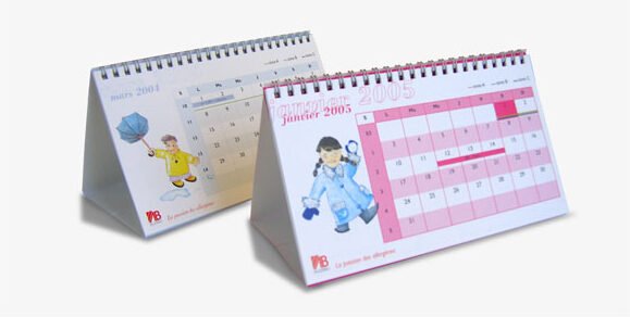
- Face 1 – Professional calendar: Monthly view featuring key dates for French, European, and international allergology conferences and events
- Face 2 – Clinical reference: Comprehensive allergen reference list for desensitization treatments—turning decorative object into daily work tool
- Desk chevalet format: Optimized for easy consultation in both consultation rooms and office settings
2. Visual differentiation: warmth in clinical spaces
- Illustration concept: Created seasonal narrative following characters through the year
- 2007 edition: 12 original watercolor illustrations depicting a young girl experiencing seasonal changes
- 2008 edition: New series featuring a young boy, maintaining consistency while refreshing content
- Childlike, gentle aesthetic: Deliberately softened clinical environment with warm, accessible imagery—rare in pharmaceutical B2B communications
- Brand coherence: Ensured illustrations aligned with Allerbio’s patient-centered positioning
3. Production optimization: custom quality at competitive cost
- Cost analysis: Audited off-the-shelf solutions to identify cost drivers and savings opportunities
- Custom production strategy: Designed bespoke format achieving 25-40% savings vs. ready-made alternatives
- Print vendor management: Coordinated with Metz-based printer to optimize die-cutting, binding, and finishing
- Technical preparation: Created print-ready files including die-cut specifications and color management
- Quality control: Ensured production quality met pharmaceutical industry standards
Outcomes
- Strong practitioner adoption: Calendars displayed prominently in allergologists’ offices and consultation rooms
- Competitive differentiation: Small French laboratory visually distinguished from multinational competitors
- Cost efficiency: Delivered premium custom product at 25-40% lower cost than generic solutions
- Brand reinforcement: Dual functionality communicated Allerbio’s practical, physician-focused values
- Annual renewal: Success led to continued collaboration across multiple editions
Key learnings
- Utility beats beauty alone: Calendars succeeded because they solved real workflow problems, not just through aesthetic appeal
- Differentiation through warmth: In sterile B2B pharmaceutical contexts, human-centered illustration created memorable emotional contrast
- Custom doesn’t mean expensive: Strategic production planning delivered bespoke quality at off-the-shelf pricing
- Desk real estate is competitive: Practitioners’ workspaces are battlegrounds—only genuinely useful tools earn permanent placement
Beyond delivery: These calendars demonstrated that even traditional marketing materials can transcend promotional noise by genuinely serving users’ daily needs—transforming a forgettable giveaway into an indispensable desk companion.