
TL;DR
Following Finemedia’s acquisition by Solocal Group, led the complete brand refresh from an 8-year-old DIY identity to a cohesive design system deployed across 450 websites. Co-created the final logo with agency Royalities, then built the UI kit for seamless product integration. The rebrand coincided with a major UX/UI overhaul and a strategic name change from ComprendreChoisir to Ooreka, requiring parallel work with naming agency Seenk.
INFOS
- Client: Ooreka (formerly ComprendreChoisir)
- Role: Brand Management (Brand & Product)
- Target Users: End-users across 450 websites and internal product teams
CORE SKILLS
- Brand Identity Design
- Design System
- UI Design
- Agency Collaboration
- Stakeholder Management
- Adobe Creative Cloud (Illustrator, Photoshop, InDesign)
KPIS
- +16 points in the annual brand recognition study (Y+1 post-launch)
- 450 websites unified under new identity
- 100% team adoption of the owl mascot
- Simultaneous deployment with major UX/UI platform overhaul
CHALLENGE
After 8 years with a identity I’d created in just a few days at launch, Finemedia finally had the budget post-acquisition to work with a professional agency.
The challenge? Transform that DIY brand into a scalable system for 450 websites—while the CEO decided halfway through to not just refresh the logo, but completely rebrand from ComprendreChoisir to Ooreka. All of this during a major technical and UX/UI platform redesign
APPROACH
Phase 1: Logo Evolution
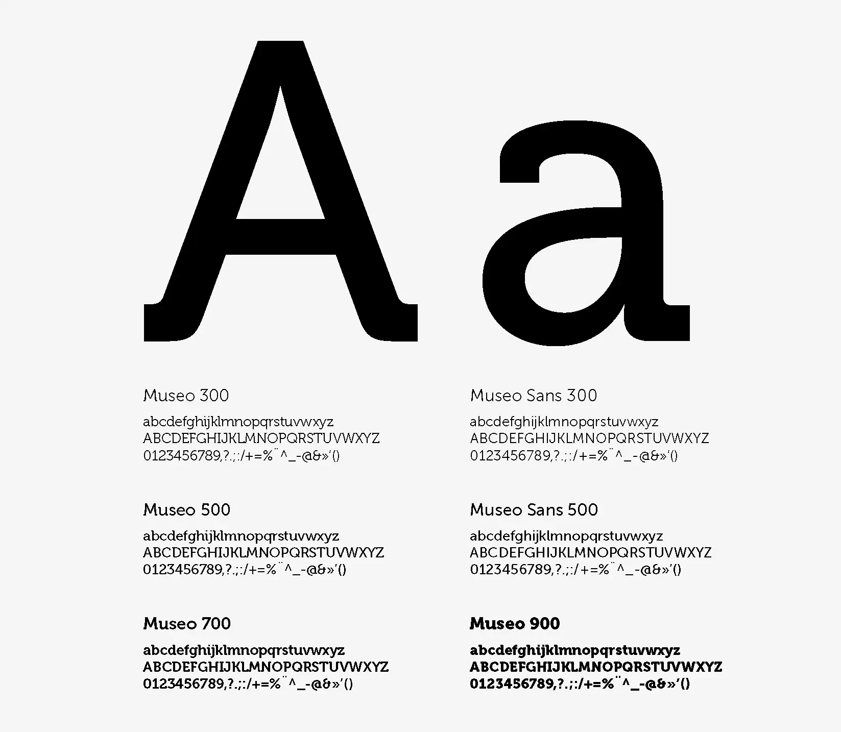
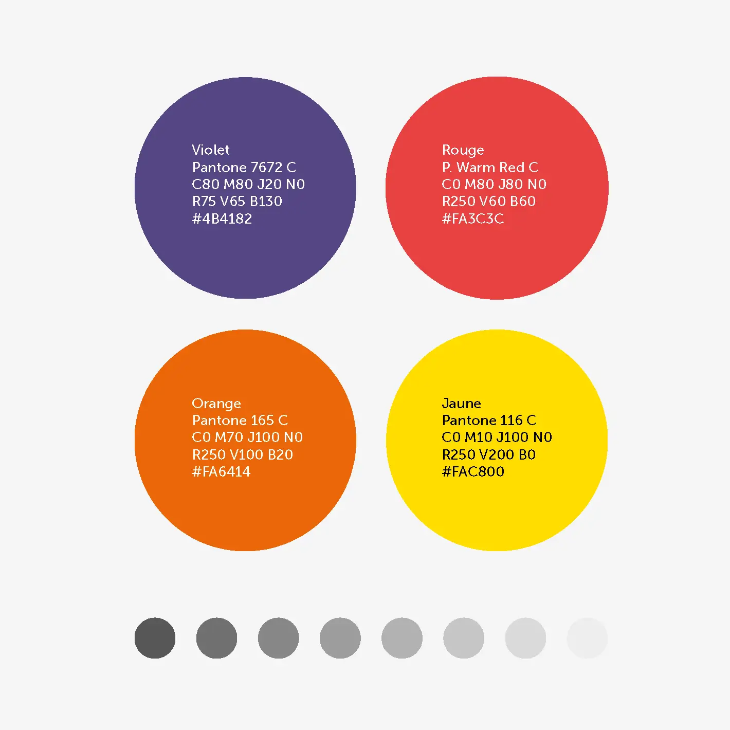
Initially partnered with agency Royalties to refresh the existing ComprendreChoisir identity. I supervised the creative direction, then co-created the final logo by selecting the color palette and typography that would anchor our entire system.
Phase 2: The Plot Twist
Mid-project, leadership decided to rebrand entirely. We brought in naming agency Seenk to develop the new name (Ooreka) and brand platform, while adapting our visual work in parallel with Royalties.
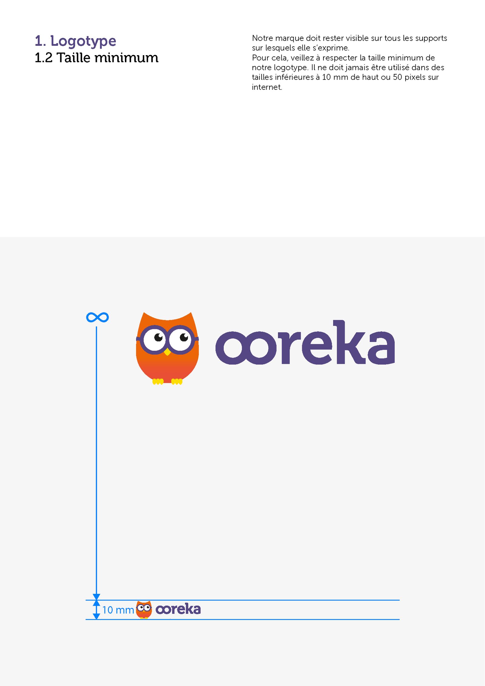
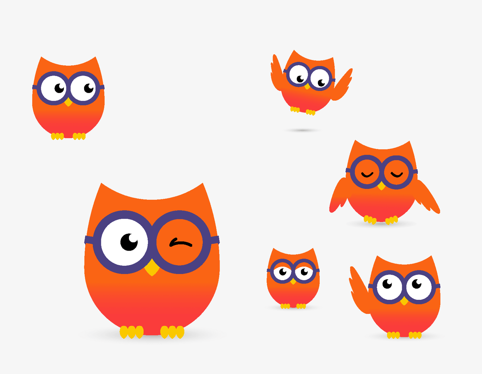
Phase 3: System Building
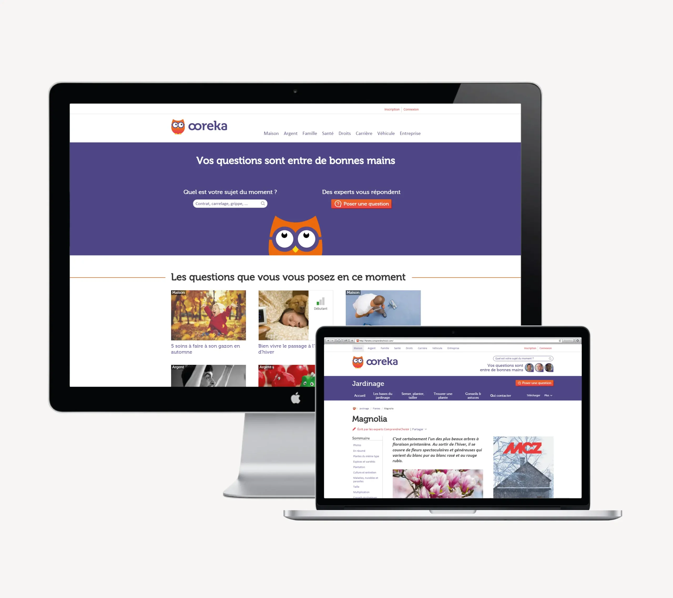
Defined the complete design system: typography hierarchy, color guidelines, logo variations, and applications for our owl mascot. Built a comprehensive UI kit specifically for web deployment across our 450-site ecosystem.
Phase 4: Orchestrated Rollout
Coordinated the brand deployment with the simultaneous launch of our redesigned UX/UI platform—ensuring visual and functional cohesion across all touchpoints.
IMPACT
- Brand recognition grew +8 points in the year following launch
- 450 websites successfully unified under the new identity system
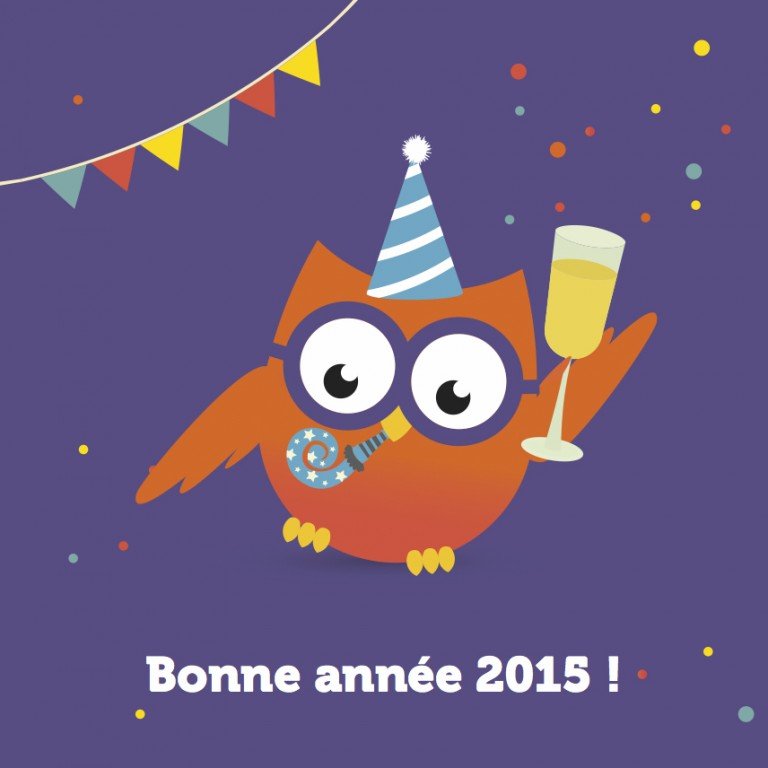
- The owl mascot became beloved internally—spontaneous adoption across all teams, from product to marketing
- Seamless integration and successful deployment alongside major technical and UX/UI platform overhaul