
TL;DR
Created brand identity and visual system for Skriv, a project management SAAS startup launching into a saturated market.
Designed a scalable design language that differentiates from competitors while seamlessly translating from marketing to product interface—enabling rapid product development with consistent brand expression.
Infos
- Client: Skriv (Startup)
- Role: Freelance Brand & Visual Identity Designer
- Target users: B2B (project teams seeking adaptive, predictive workflow automation)
Core skills
- Logo Design & visual identity
- Design Systems Foundations
- Brand Strategy & Positioning
- Adobe Illustrator / Figma
- Startup Branding
KPIs
- Complete brand package delivered
- Design-to-product continuity
- Market differentiation
- Scalable foundation
The challenge: standing out in a saturated market
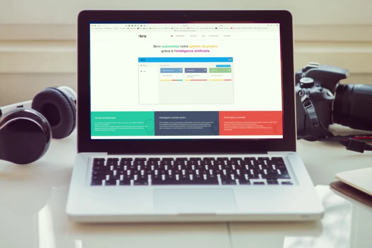
Skriv entered a market dominated by established players like Asana, Monday, and Trello. Unlike competitors offering rigid frameworks, Skriv’s unique value was adaptive intelligence—a tool that molds to existing workflows, automates assignments, and predicts project issues before they escalate.
The visual identity needed to communicate this sophistication while remaining approachable. More critically, it had to translate seamlessly from marketing assets into the product itself—creating a unified brand experience from first impression to daily use.
My approach
1. Strategic positioning through visual language
- Competitive analysis: Mapped competitor visual territories to identify differentiation opportunities
- Brand attributes: Translated “adaptive,” “intelligent,” and “unobtrusive” into visual principles
- Dual-purpose design: Created elements that work as brand assets and UI components
2. Logo system: flexibility meets recognition
- Modular construction: Designed wordmark and symbol to work independently or together
- Technical optimization: Ensured legibility across scales—from favicons to billboards
- Marges & spacing: Defined clear usage rules for consistent application
3. Color & typography: building for scale
- Accessible color system: Palettes designed for WCAG compliance and UI flexibility
- Hierarchical clarity: Typography choices optimized for interface legibility and brand expression
- Design system foundations: Guidelines structured to enable direct integration into product development
Outcomes
- Unified brand-product experience: Visual identity seamlessly extends from marketing to SaaS interface
- Market differentiation: Distinct positioning in crowded project management landscape
- Development efficiency: Clear guidelines enabled rapid product design without brand inconsistency
- Scalable foundation: System supports growth across touchpoints without constant oversight
Key learnings
- Design for dual contexts: Startup identities must work as brand assets and product components from day one
- Simplicity enables scale: The most effective systems are easy to understand and apply without designer supervision
- Brand strategy informs visual choices: Every color, typeface, and spacing decision reinforces positioning
Beyond delivery: This wasn’t just a logo—it was the visual foundation for a product experience. By designing for both marketing impact and interface integration, I gave Skriv a cohesive identity that could grow with the company, from launch pitch to daily user workflow.